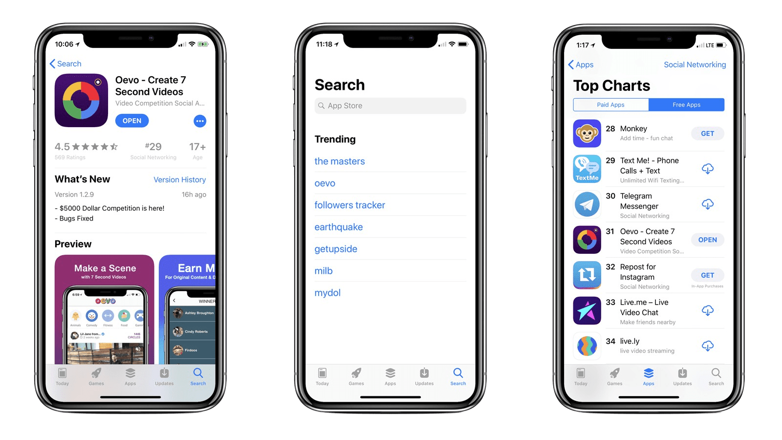
After we launched our beta and people started to use OEVO, we recognized certain issues they were facing. We opened up our social media accounts to feedback and asked users to utilize our website to report bugs and recommend changes or features. While smaller bugs and design flaws came up, we changed them quickly; releasing updates of OEVO every 2-3 days. However, as feedback and recommendations came pouring in, I knew that we would soon need to refresh the design of OEVO.
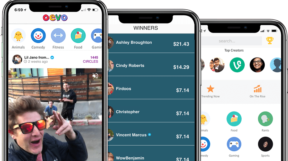
To help with the design process this time around, I created group-chats with 50-100 of our most active users and asked them about features & design changes they wanted in the new implementation. Then, I talked to our Developers and Engineers to discuss limitations and implementations of new features. While our Engineers worked on developing and adding core new features such as group-messaging, donating, and sponsoring; I went back to creating. I used our existing design as the backbone and starting point for the more modern and refreshed design that's live on the App Store today and shown below.


